
you can also read this article in Medium -> click here
A Developer’s Cheatsheet
Tired of always forgetting how to style and adjust the Next.js Image component in your layout? Full-width, adjust to parent’s container height, fixed height and width… it can get confusing.
Here a summary of the most common use cases, focusing on the practical side of things, which will allow developers to spend less time worrying about the images and more time building a great website.
1. Fixed width and height
Alright, let’s start with the easy one. Simple use case: Two images 300x300 next to each other:
// in a Next.js Component using tailwind

<div className="w-full flex justify-center items-center">
  <Image src={"/car.jpg"} alt={"Car"} width={300} height={300} />
  <Image src={"/plane.jpg"} alt={"Plane"} width={300} height={300} />
</div>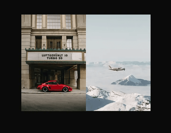
Very nice looking and easy. You can use this, for example, where in a section, multiple images with fixed size are aligned next to each other. Get some hover effects, overlay text, bring the opacity down and have something like this: (Now is the right time to say that I use Tailwind CSS in all my examples)
// Example of two images next to each other
// with darker opacity and text
<div className="w-full flex justify-center items-center gap-x-10">
  <div className="relative">
    <Image src={"/car.jpg"} alt={"Car"} className="opacity-30" width={300} height={300} />
    <div className="absolute top-20 left-1/2 -translate-x-1/2 -translate-y-1/2 text-2xl font-bold tracking-widest">TRAVEL</div>
  </div>
  <div className="relative">
    <Image src={"/plane.jpg"} alt={"Plane"} className="opacity-30" width={300} height={300} />
    <div className="absolute top-20 left-1/2 -translate-x-1/2 -translate-y-1/2 text-2xl font-bold tracking-wider">HIGH</div>
  </div>
</div>
Now you know how to quickly get this in your website with the code snippet above.
2. Dynamic image size
When width and height are unknown. We can use fill —
<Image src={“/car.jpg”} alt={“Car”} fill objectFit=”cover” />
This needs the parent to have position set to relative, fixed or absolute, though AND
the parent component must have width and height set, because with fill — the image just fills the parent element.
Working example:
// only fill - no width and height

<div className="relative w-1/4 h-[30vh] flex self-center">
  <Image src={"/car.jpg"} alt={"Car"} fill objectFit="cover" />
</div>BUT, If we need two images next to each other, each one of them should have a parent with set position,
width and height . Otherwise they will stack up on each other and only one will be visible,
because fill automatically sets the Image position to absolute :
// two images

<div className="w-full flex justify-center items-center gap-x-10">
  <div className="relative w-72 h-96">
    <Image src={"/car.jpg"} alt={"Car"} fill objectFit="cover" />
  </div>
  <div className="relative w-72 h-96">
    <Image src={"/plane.jpg"} alt={"Plane"} fill objectFit="cover" />
  </div>
</div>
3. Static image import
Another way to not specify width and height is to statically import an image.
This is similar to the previous code snippet but without the fill attribute
import Image from "next/image";
import Car from "../public/car.jpg";
import Plane from "../public/plane.jpg";
export default async function Home() {
  return (
    <div className="w-full flex justify-center items-center gap-x-10">
      <div className="relative w-72 h-96">
        <Image src={Car} alt={"Car"} />
      </div>
      <div className="relative w-72 h-96">
        <Image src={Plane} alt={"Plane"} />
      </div>
    </div>
  );
}
4. Blur placeholder
If we use static import like the previous example, we only need one attribute for this cool effect: placeholder="blur"
import Image from "next/image";
import Car from "../public/car.jpg";
import Plane from "../public/plane.jpg";
export default async function Home() {
  return (
    <div className="w-full flex justify-center items-center gap-x-10">
      <div className="relative w-72 h-96">
        <Image src={Car} alt={"Car"} placeholder="blur" />
      </div>
      <div className="relative w-72 h-96">
        <Image src={Plane} alt={"Plane"} placeholder="blur" />
      </div>
    </div>
  );
}

if we don’t use the static import, we must specify a blurDataURL:
import Image from "next/image";
export default async function Home() {
  return (
    <div className="relative w-72 h-96">
      <Image src={"/car.jpg"} alt={"Car"} fill placeholder="blur" blurDataURL="data:image/jpeg;base64,YOUR_IMAGE_BASE64_ENCHODED" />
    </div>
  );
}
This will also work with a static export! One must set the images to unoptimized in the Nextjs configuration though. This means that our website won’t take advantage of the Image Optimization that Nextjs provides but will still show the blur effect. We can still optimize our Images with Nextjs static export, but this is a topic for another time! Here the configuration
const nextConfig: NextConfig = {
  output: "export",
  images: {
    unoptimized: true,
  },
};
Conclusion
The Next.js Image component can be very powerful and do a lot with a minimal setup. By mastering its basics and understanding common use cases, developers can optimize their workflow and code faster. I myself needed some time to start using it seamlessly in my projects, so keep experimenting and building — your users will thank you for it!